The Glow of Hope
Janhavi Rai
Introduction:
The Glow of Hope is a picture also known as ‘Woman with the Lamp’. This picture was created by S L Haldankar between 1945 and 1946. This was a time when Indian artists attempted to produce realistic scenes and portraits in what became known as the British Academic Style. It was named after the Royal Academy in London, whose art techniques were borrowed by teachers at the prestigious JJ School of Art in Bombay. Haldankar was one of the last remaining academic realists.
This painting is currently housed in the Sri Jayachamarajendra Art Gallery at Jaganmohan Palace in Mysore, India.
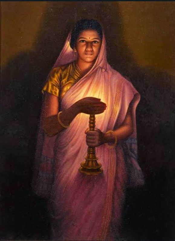
Figure 1. The glow of hope (painting)
The legend behind this painting dates back to Haldankar’s observation of his daughter, who was wearing a stunning saree and holding a candle with her hands shielding the flame, on the night of Diwali. Her face was softly illuminated by the light beams that passed through the space between her fingers. Haldankar was inspired by this and decided to create this mesmerising beauty on a canvas.
Gita, the painting’s inspiration and Haldankar’s youngest daughter, was just 13 years old at the time. She described how she posed for the painting for three hours every day for three days in a press conference. She had no idea at the time that being her father’s inspiration would make her immortal and turn her into a famous piece of art.
Psychology, meaning and metaphor:
A lady stands dressed up in a purple saree, with a softly illuminated golden yellow blouse, holding a candle lamp. She is seen to be shielding the flame with her hands. The beam of light through her fingers is casting a soft glow on her face and forging a shadow on the wall which adds to the effect of the overall painting. As her gaze meets the observer, it casts a serene imprint on the mind and the brain.
Undoubtedly, Colours in the painting play a huge role when it comes to the calming effect that they are laying.
Henri Matisse, one of the most prominent artists of the twentieth century, articulated the theories of colour psychology when he said, “With colour, one obtains an energy that seems to stem from witchcraft.” He was correct about the vitality that colour carries. What we now know is that the energy he’s referring to is a result of colour psychology. Understanding colour psychology allows us to powerfully impact the surroundings we occupy, making them more suitable to their intended objectives.
The human eye is capable of recognising over ten million colours. However, as each colour travels through the visual cortex in our brains, it affects us differently based on its hue, saturation, and lightness, among other perceptual characteristics. It’s been said that reds and oranges are energising colours, and blues and greens are calming. However, new findings in the fields of neuro-aesthetics and colour neuroscience indicate that colour affects humans biologically in addition to psychologically and emotionally. Our blood pressure, breathing, and even body temperature can all be impacted by colours. For example, the colour red increases our skin’s galvanic response, which controls how our sweat glands respond, while the cooling properties of blues and greens have been demonstrated to lower stress and promote creativity.
Starting with the colour of the saree, as she is draped in a purple coloured one and it is softly illuminated by the light of the candle lamp, we will analyse how and what effect does it hold psychologically and how it enhances the painting overall. The colour purple has a strong connotation with wealth, prosperity, royalty, and refinement. This is because only the very wealthy could afford to wear purple garments due to the high expense of purple dye. Purple is now thought to be energising and relaxing for the mind and nerves. Raising our awareness also fosters creativity and provides a sense of spirituality.
While looking at the colour, increases brain activity related to problem-solving. However, too much purple can cause or worsen depression in certain people. Those who are susceptible to these depressive conditions should use this colour very sparingly and with great caution. Purple also encourages meditation, which helps to maintain mental stability and balance by fostering emotional and mental harmony.
Now coming to the softly illuminated golden yellow blouse, just the colour of the saree, it also lays the same calming effect, adding to the overall serenity of the painting.
Yellow facilitates the release of serotonin, a neurotransmitter, in the brain. This indicates that yellow is a fantastic colour for elevating mood, enhancing focus, and speeding up metabolism. Because of the amount of light it reflects, yellow should only be used sparingly to prevent “colour fatigue” in the eyes.
Hence as the colours adhere to the aforementioned psychological reasons and caution, it adds to the calming of the painting.
Furthermore, the painting was made on the eve of Diwali, hence, it is only justified to say that the contrast between the light and the shadow, depicts the spiritual victory of light over darkness, good over evil, and knowledge over ignorance and thus it’s a glow of hope
Method:
This artwork is unique since it was created with watercolour, on handmade paper, demonstrating the artist’s skill. The contrast between the shadow and light points to the method of Chiaroscuro; this is an Italian phrase that translates to ‘light-dark’. In paintings, the description refers to distinct tonal contrasts that are frequently employed to represent the volume and modelling of the subjects shown. In regards to lighting, definite moments are better captured with brightness or darkness. And, while those are undoubtedly viable options when a painter, director, or cinematographer uses light and shadow, high-contrast lighting can give a third dimension to their work through the method. Leonardo da Vinci said and I quote “Every painter should begin every canvas, with a wash of black”, since all things in nature are dark except when illuminated by light. Leonardo da Vinci and Caravaggio are well-known artists who used chiaroscuro in their work. Leonardo used it to create a strong sense of three-dimensionality in his figures, whilst Caravaggio used it for dramatic effect. Both artists were conscious of the emotional significance of the effects.
Conclusion:
Perfectly executed, the painting is proof of Haldankar’s brilliance. S.L. Haldankar was proficient in both oil and watercolour painting. Maybe he picked the watercolour to demonstrate his skill. The benefit of oil-based paints is that errors can be fixed by applying additional coats of paint. Nevertheless, watercolour is not a medium that permits such freedoms. Unbelievably, an Italian encyclopaedia lists Haldankar as one of the top three watercolour painters in the entire world!
References:
- Swadesi. (2023, September 10). The Glow of Hope: A Mesmerizing Painting by S.L. Haldankar. Swadesi. https://swadesi.org/the-glow-of-hope-a-mesmerising-woman/
- Glow of Hope – Canvas Prints. (n.d.). Tallenge Art Store. https://www.tallengestore.com/products/glow-of-hope-woman-with-the-lamp-canvas-prints
- The National Gallery, London. (n.d.). Chiaroscuro | Glossary | National Gallery, London. https://www.nationalgallery.org.uk/paintings/glossary/chiaroscuro
- ArtGeek. (2020, January 26). Is it Chiaroscuro or is it Tenebrism? ArtGeek. https://blog.artgeek.io/2019/10/17/is-it-chiaroscuro-or-is-it-tenebrism/
- Heckmann, C. (2021, December 20). What is Tenebrism — The Art of Light and Shadow Explained. StudioBinder. https://www.studiobinder.com/blog/what-is-tenebrism-art-definition/#:~:text=Chiaroscuro%20and%20tenebrism%20both%20focus,subject%2C%20tenebrism%20goes%20full%20black.
- Hawke, R., & Hawke, R. (2021, July 22). The Colour Purple – Psychological Properties. Inspired Spaces | Plan and Design Commercial & Residential Interior Spaces Sydney Wide. https://www.inspiredspaces.com.au/the-colour-purple/#:~:text=From%20a%20colour%20psychology%20perspective,Calming%20to%20mind%20and%20nerves
- Details. (2022, July 27). Color Psychology: Purple. Miss Details, Scottsdale, Arizona. https://missdetails.com/color-psychology-purple/
- Stone, J. (2024, July 9). 4 Color Trends That Are Good for the Brain. Metropolis. https://metropolismag.com/products/4-color-trends-that-are-good-for-the-brain/
- https://edition.cnn.com/2017/10/13/health/colorscope-gold-allure/index.html
